

A home is so much more than a house. Even before its transformation by local firm SHEEEP, the humble property of Nick and Chris in Toronto’s Little Portugal has long served as a cultural hub with a tacit mi casa es su casa open-door policy. It’s the favourite hangout for a group of friends that gather regularly to watch movies projected onto the home’s back wall on summer nights, to share meals and just to “crash.” The 130-square-metre abode is itself something of a social creature: It’s situated in the middle of a set of row houses dating back to the late 1800s on a lot that was cheaply built up, possibly to accommodate rail workers.
When they bought it over eight years ago, the couple split the residence into two apartments — one for themselves on the ground floor, the upstairs rented to friends — divided by a wall extending from the front door and providing separate entry to either space. Against the main floor’s picture window, where a typical layout might place a living or dining area, the duo had positioned their bedroom.

But by 2021, they were ready to transform their living space into a deeper reflection of their personalities, while also continuing to meet the needs of their intimate community. They hired local architect Reza Nik, owner of SHEEEP, to design what they describe as “a peaceful place that’s still modern” and “an amalgamation of both of their tastes and backgrounds.” Nick is a transit planner with an affinity for Scandinavian culture; Chris, a filmmaker, has Spanish and Colombian roots. Their first directive: Make it colourful.
“Everyone thinks of everything as an investment property, so they’re afraid of colour,” says Nick. “But for us, there was a sense of, We’re going to be here til we’re old. We were not held down by the idea of selling in five years. Instead, it was more like, Let’s think outside the box. What do we want?” They worked with Nik and his designer Connor Stevens, in a collaborative process that made ample use of Miro — a digital whiteboard that allows documents, renderings and feedback to be gathered in one virtual spot.
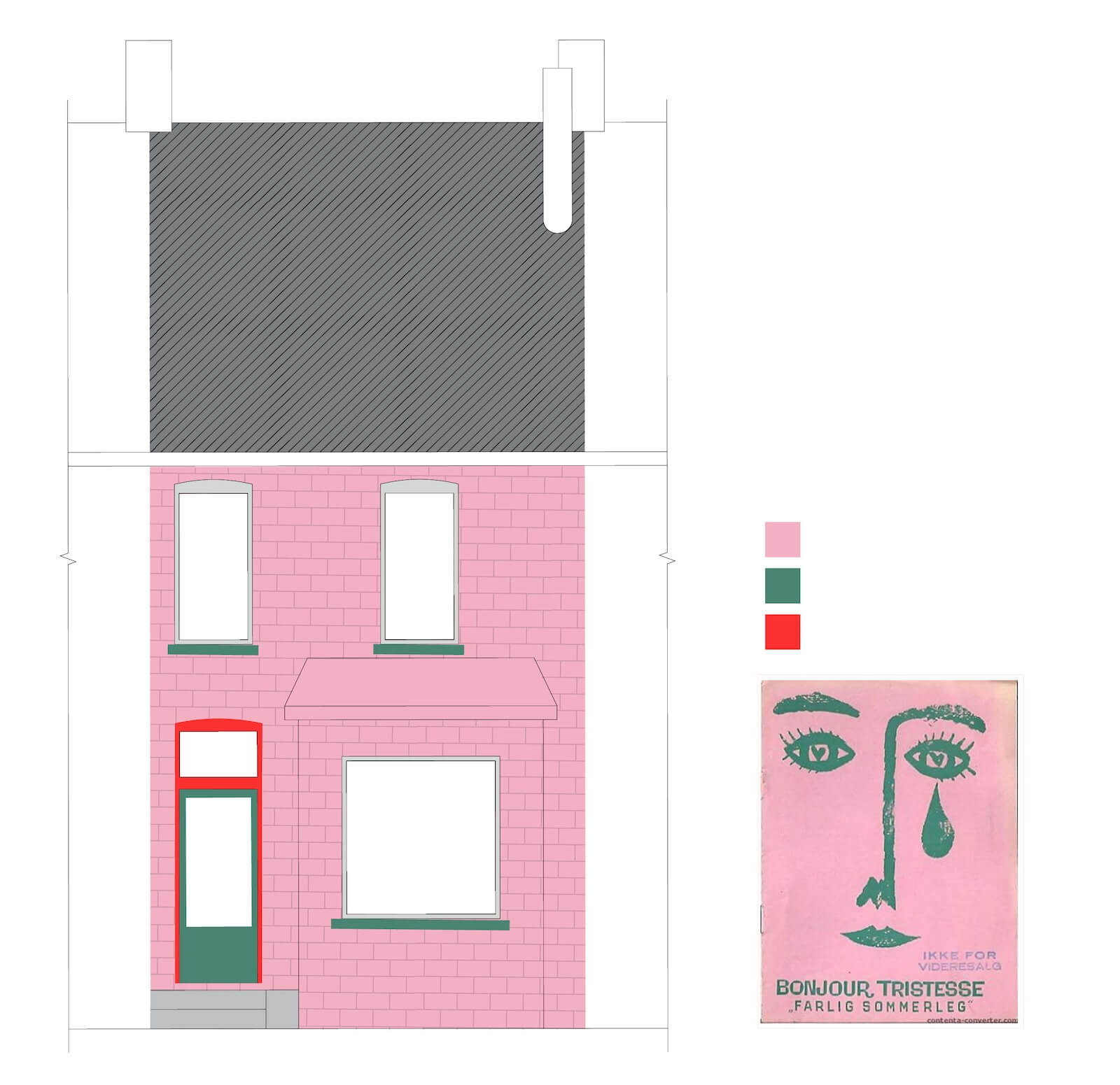
“One of the first things I sent in were the movie posters for Bonjour Tristesse,” Chris explains, referencing the 1958 Otto Preminger film. The pink and green version of the advertisement is high up on the Miro board, and SHEEEP ran with it. “The cultural connection was always going to be a part of the house,” Nik explains. “In the initial email they sent, which became part of the text of the contract, it said, ‘Spain, Colombia, Denmark.’ They wanted their home to have life!” But while the duo craved a home with a rich character, Nik was also careful to edit the palette. “Maybe the front of the home is more of an introvert and the back is extroverted.”

But first things first. The project could not begin without gutting the house and its mechanical system; from the beginning, the environmentally conscious owners were committed to a switch to electric in an effort to be as passive as possible. Anyone who has gone through a renovation knows how disorienting it can be — and this one came with its share of doozies. “I’d never seen a tree in a basement before,” recalls Ruth Wilford, the project’s contractor and the head of Renovations Ruth, hired to help realize the vision. An earlier owner, upon discovering that the home was built on grade, had used a tree trunk to support a newly installed six-by-eight-inch sill plate.

“When trying to figure out how to get the tree trunk out, we realized there were no footings,” says Wilford, “so we brought in a soil engineer, and he determined the soil was compact enough and we wouldn’t need to underpin the basement.” At the top of the house, meanwhile, a fire had scorched the attic rafters, and the ceiling joists in the middle bedroom were wiggling in place: The unsupported roof needed to be reinforced with collar ties or it would continue to push the back wall out. “The hardest part,” Wilford sums up, “was trying to just build another house inside an existing house where nothing was level, nothing was plumb, nothing was square.”

For Nick and Chris, the revelations that multiplied as the walls and ceilings were peeled back began to take a toll. “The house uncannily mirrored my internal state,” says Nick. “The last winter, as the renovation was dragging on, our social connections frayed.” Chris, meanwhile, began to see the project echoing his work on a feature film he was busy producing in Italy. “In the movie, it’s unclear if the main character is having a psychotic breakdown or is experiencing divine enlightenment.”
Wilford found many opportunities in the challenges. On the main level, for instance, she and her team uncovered a drop ceiling of over 60 centimetres — a welcome addition of volume in the compact space. To even out the floor, which was 15 centimetres off level from the front of the house to the kitchen, they sistered the joists, sitting the sisters on new walls that they framed up in the basement; in lopping off the overhanging lower section of the original joists, they were able to create extra headroom in the subterranean space.
But perhaps most importantly to the spirit of the endeavour, Wilford gifted Nik and the owners — and their next-door neighbours — a book called The Big Orange Splot: In a nutshell, after a bird drops a can of orange paint on a house, its owner embraces the colour and continues to experiment on his facade, which then grants his neighbours permission to make their own homes more expressive. This reinforced the original design vision, one filled with colour, character and gregarious energy.
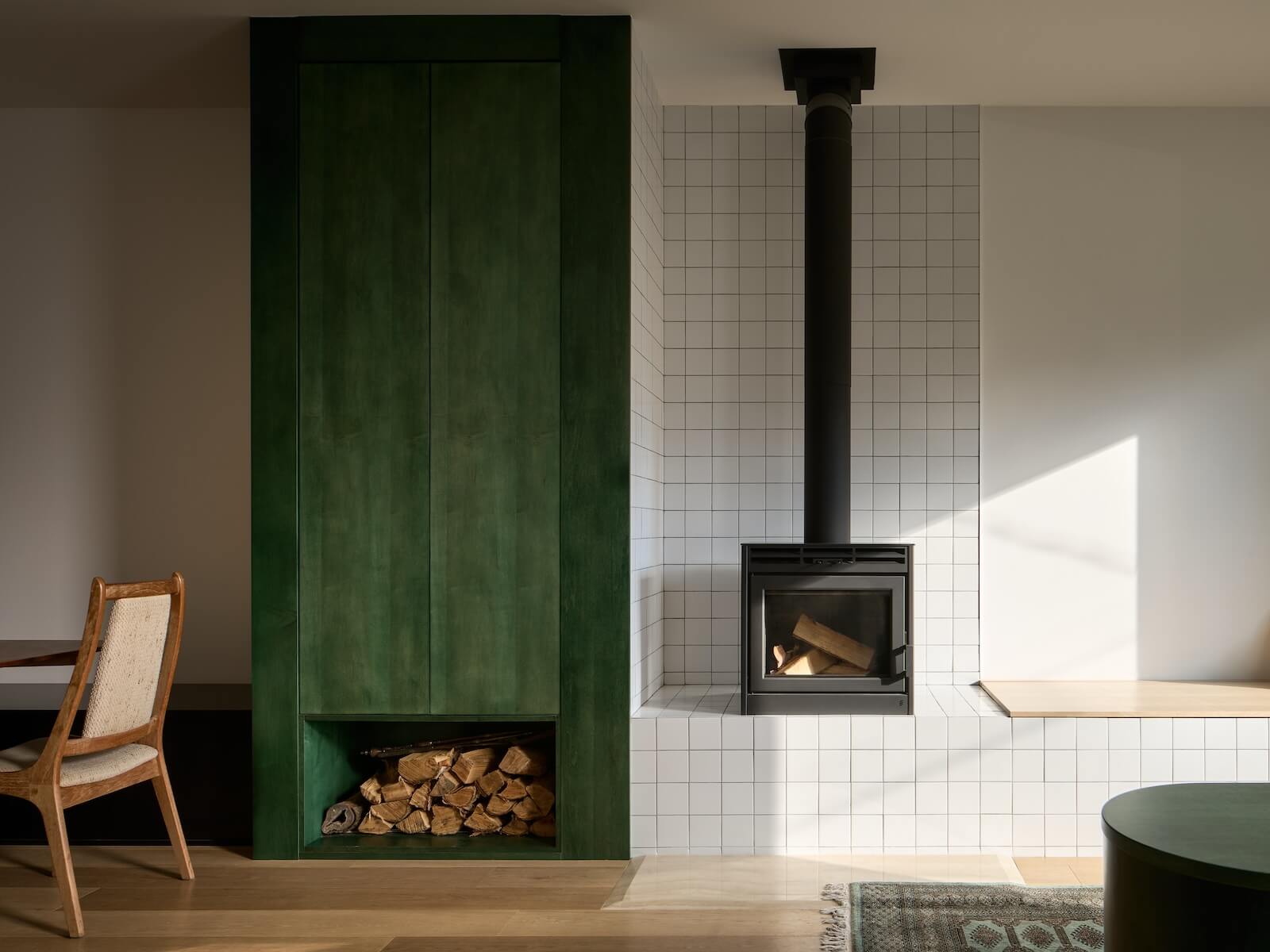
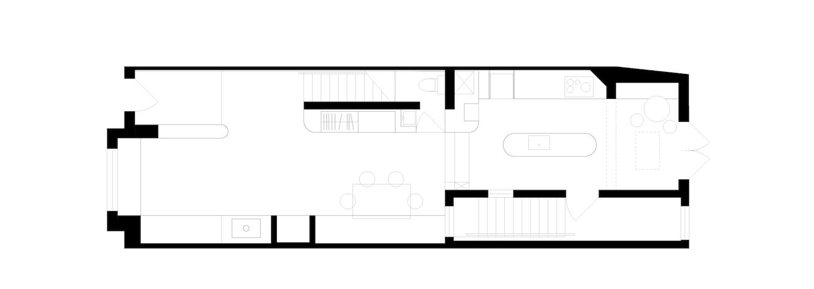
And what an expressive house Nick and Chris now have. Where their bedroom once stood, Nik and his team designed a rectilinear bench with integrated storage that wraps around the picture window. Partially clad in square white tiles, the plywood seating stretches toward a fireplace and green-stained storage cabinet with a firewood hutch. Meanwhile, the wall that once extended from the entrance has been pulled out; in its stead, a low shoe cabinet (stained a matching green) now subtly delineates the front door from the living space.

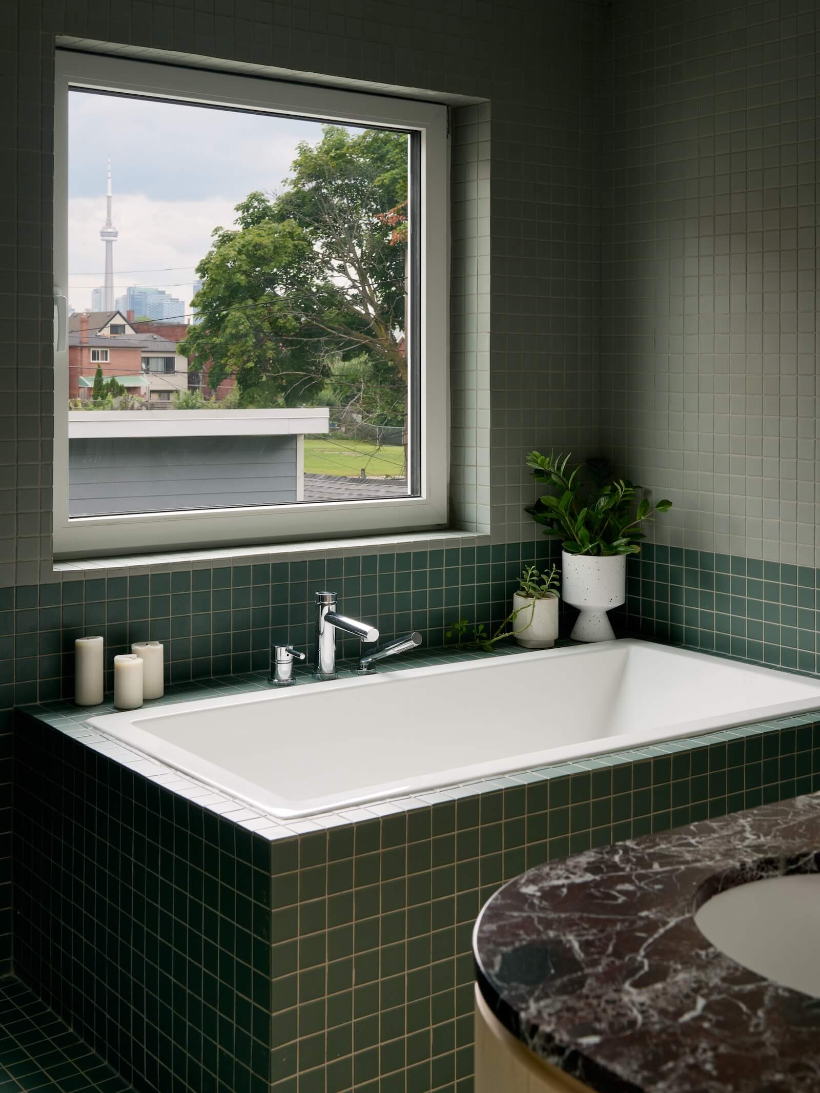
The dining area beyond the living room features a built-in coat closet with a circular cutout accommodating a bed for Pretzel, the couple’s dog. Throughout the home, SHEEEP introduced natural light wherever possible. With the drop ceiling gone, the picture window could be expanded and a hidden transom above the door was liberated; skylights were installed on both the main and upper levels. But most intriguingly, it opened up a narrow, ad hoc volume on the side of the house that contains the stairwell leading to the basement — where a sauna and cold plunge now await friends — and turned it into a “greenhouse” that funnels light down from its polycarbonate ceiling.
The kitchen might be the biggest star of the home, in that it fully articulates the pink–green colour scheme adapted from the Bonjour Tristesse poster. SHEEEP custom-designed a jewel-like, lozenge-shaped island small enough to fit the space. Because the room is too narrow to accommodate counter stools, the studio inserted a nook just beyond. Made of unfinished maple, it incorporates yet more storage.
The hues are otherwise pronounced: The island is topped in a deep green Verde San Francisco granite, the open shelving at its far end painted in Benjamin Moore’s Supple Pink to match the hood range above the stove. To add hits of nuanced shades elsewhere, Nik sourced light pink handles and knobs for the cabinetry. The floor, a speckled off-white Marmoleum, completes the tonal and material palette, which hints at a “multiform” sensibility, a term coined by British architectural writer Owen Hopkins for an aesthetic movement that aims for “multiplicity, variety and plurality.”
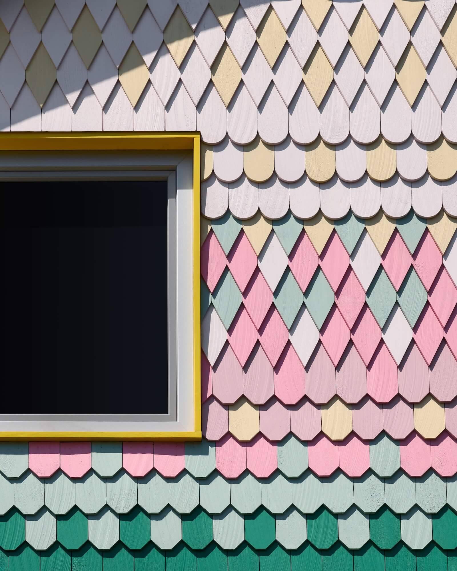
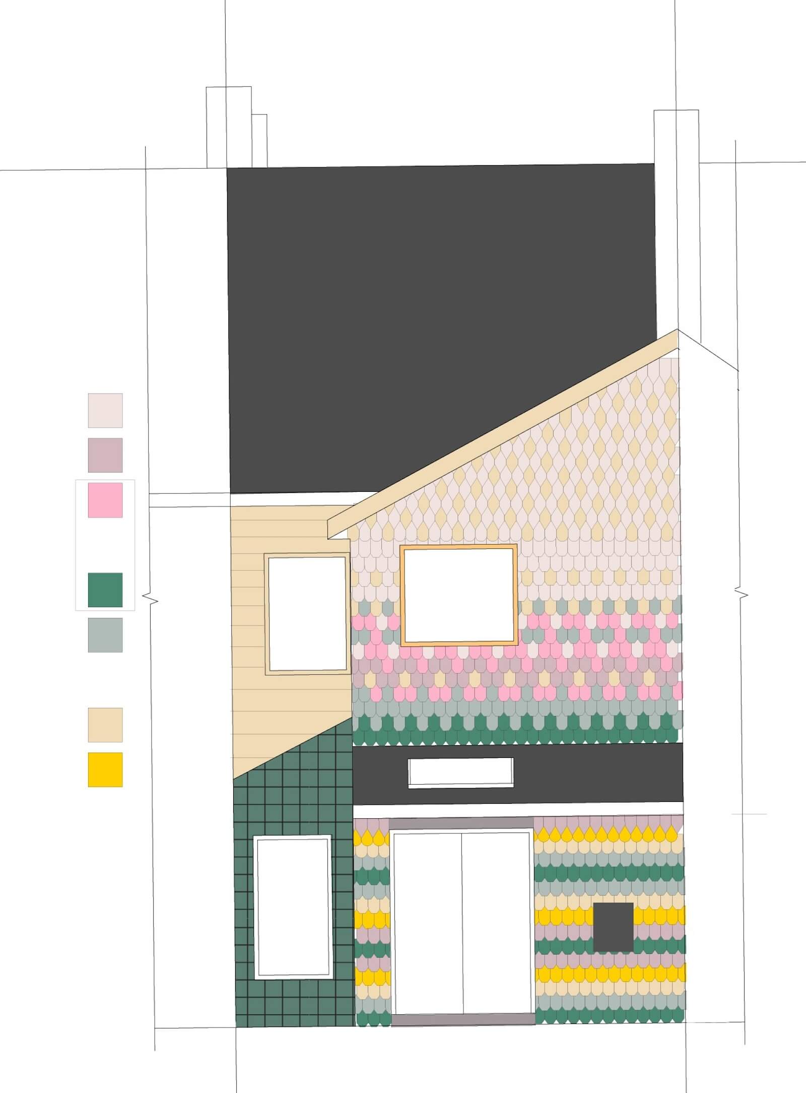
Through newly inserted double doors, you step out to the backyard. Here, the extrovert personality is conveyed via a pastel array of shingles in diamond, scalloped and square shapes. At the end of a years-long reno process that saw many of the originally selected finishes unavailable, Wilford headed to Home Hardware to purchase Pacific cedar shingles, Nik accompanying her on the phone: “How many boxes of each do they have?!” She scooped up the last of the stock and, based on the material available, Nik designed the eclectic gingerbread dream.
Most people, however, will only see the home’s facade: deep pink–painted brick and a front door outlined in red and green. For Nick and Chris, who’ve begun to bring their friends back into their home, this splash — or splot — of colour feels of a piece with the sense of broader community they want their home to project. They view the relationship with the street and the outside world as an extension of this spirit of generosity. “Every day, I see people taking selfies in front of the house,” says Nick. “Yes,” says Chris. “It’s all over social media. They call it ‘The Pink House.’ ”
Step Inside the Pink House in Toronto by Local Firm SHEEEP
This renovation of a Toronto home introduces colour, character and a sense of community.